Bookworm
The eBook app for K-8 students.
Scope: UI/UX Design + Brand Identity
Industry: Education
-
Create an app for students to connect with their school library by reading eBooks, managing reading assignments, and tracking progress.
-
Bookworm is intended for grades K-8.
The user experience is focused on students, but functions extend to schoolteachers, librarians, and parents.
-
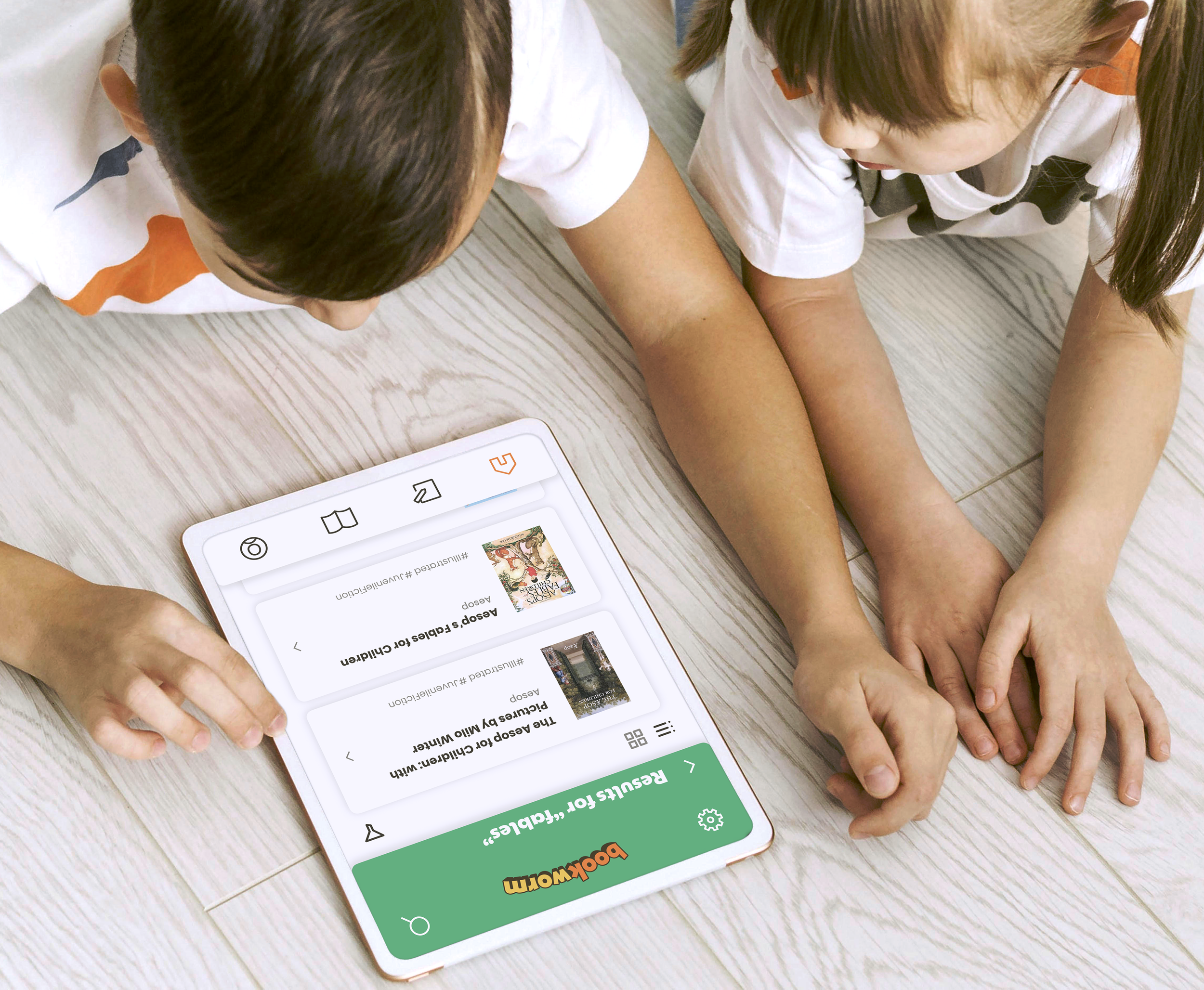
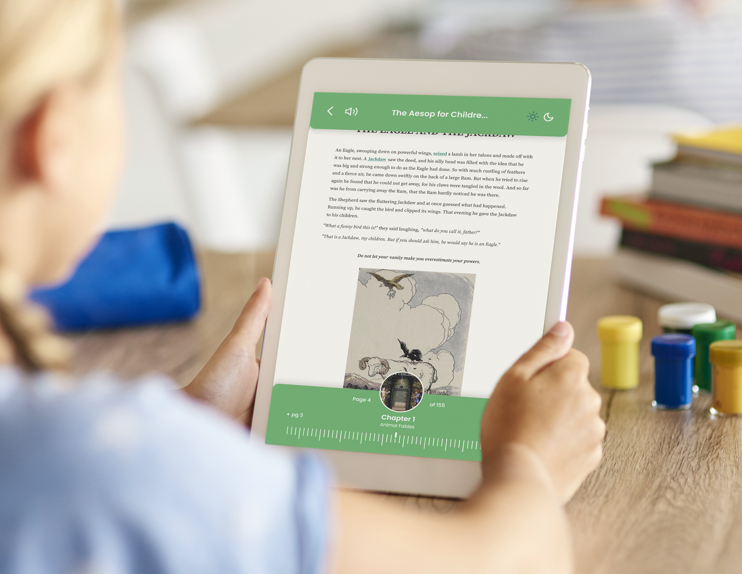
As an app designed to help young students read, the design needs to be stimulating, but not distracting.
Friendly mascots like the worm and apple make the platform fun, while tutorials and extra features keep it learning-focused.
I developed this system using the Design Thinking Process: Empathize, Define, Ideate, Prototype, and Test.
1. Empathize
Target Users
Students looking for ease of access + a more stimulating reading experience
Parents seeking to keep track of their children’s academic progress
Teachers who want their students to stay engaged outside of the classroom
Research Methods
Qualitative research (user testing)
Quantitative research (survey)
Competitive Analysis
User Personas
Persona 1: Catie
8 years old | Student | Playful, Introverted
User Statement: “Mom, my screen time isn’t even that bad!”

Pain Points
Unsure how to spell or sound out big words
Not enough library books at school
End Goal
Get ahead in class by practicing reading at home
Persona 2: Diana
37 years old | Parent | Attentive, Detail-Oriented
User Statement: “To go to a good college, my kids need to stay on track.”

Pain Points
Her kids get distracted when a screen is in their hands
Doesn’t feel involved in her kids’ learning
End Goal
See what her kids are reading and how quickly they progress
2. Define
Requirements
Product
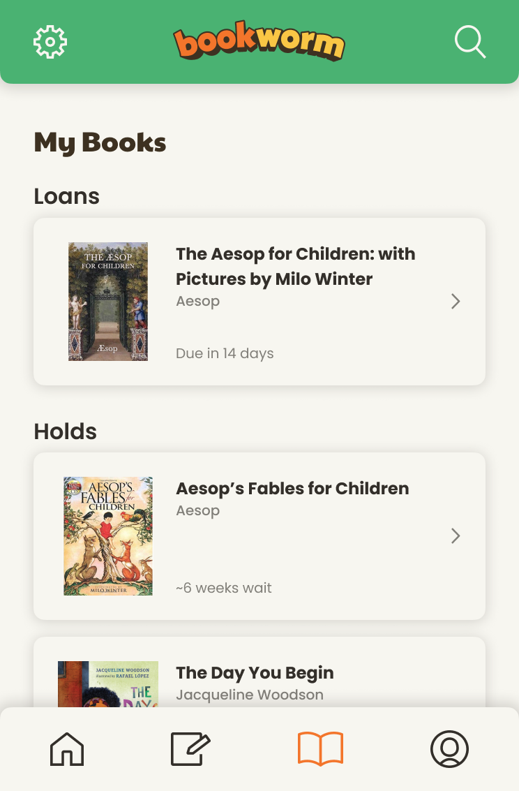
This app is for students to borrow, read, and return eBooks owned by their school.
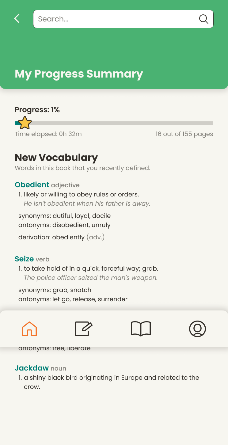
The app enriches learning with features like vocabulary terms and read aloud.
User
Primary users are students, parents, and teachers.
Satisfies needs to support learning and enhance communication about lessons.
Technical
Intended for use on iPads & computers, but the design can adapt to multiple screen sizes and orientations.
Business
Competitors: Libby, Kindle
Bookworm differentiates by offering read-aloud features, animations, and integration with school libraries.
User Flows
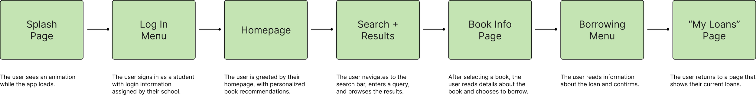
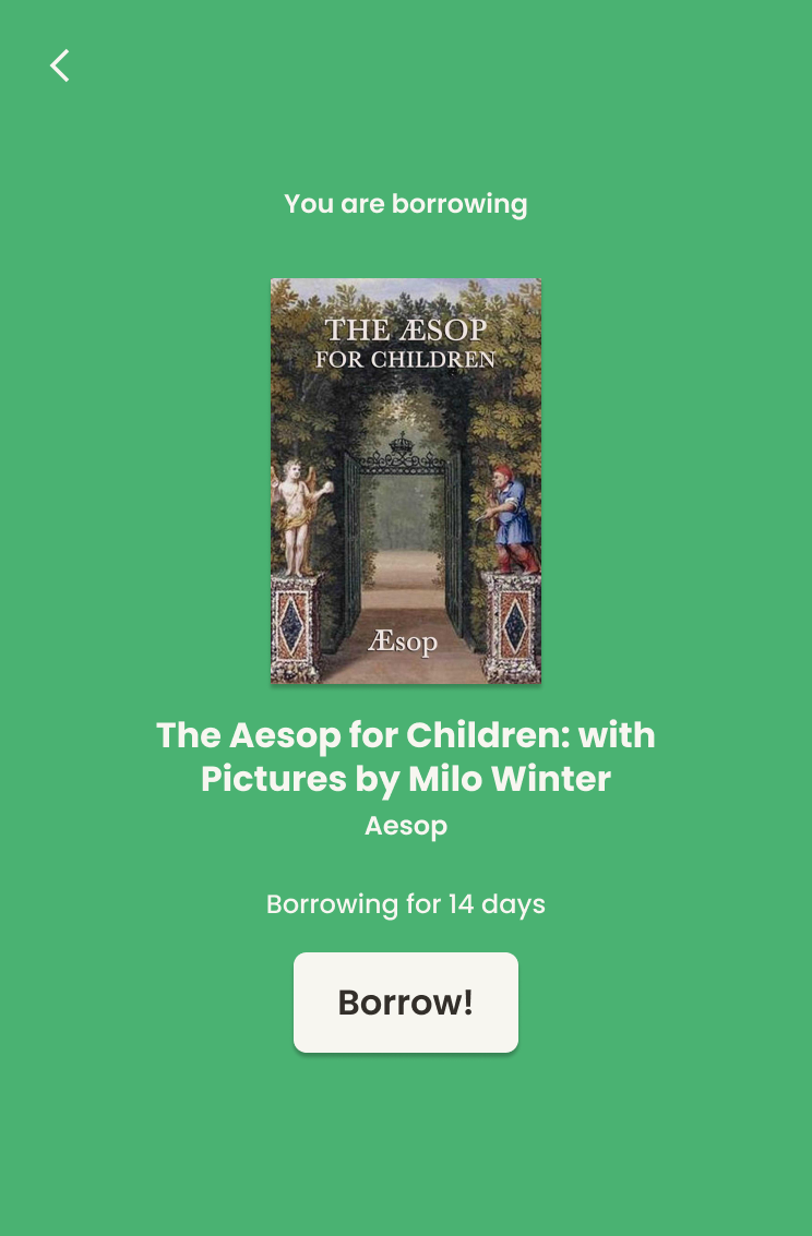
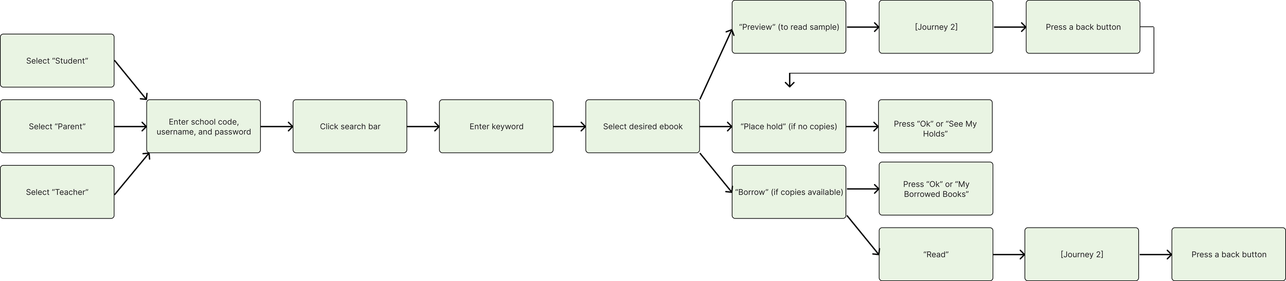
Flow 1: Sign in & borrow an eBook.
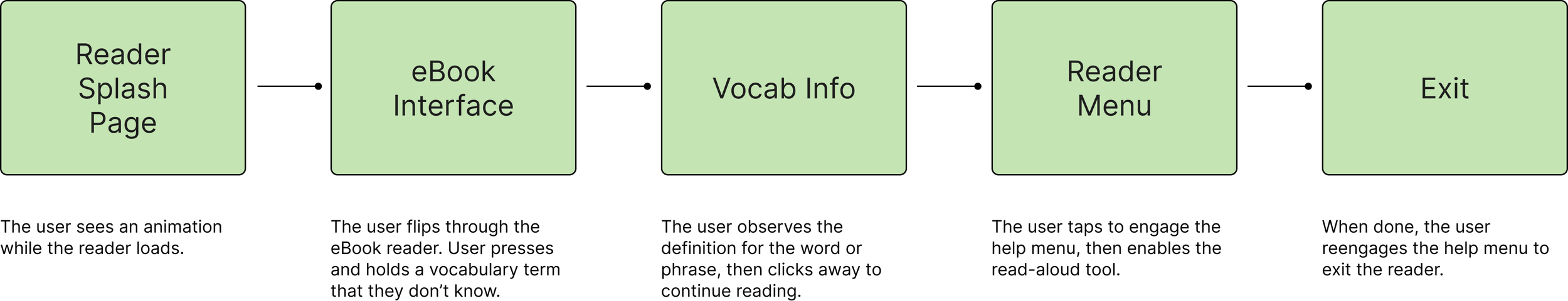
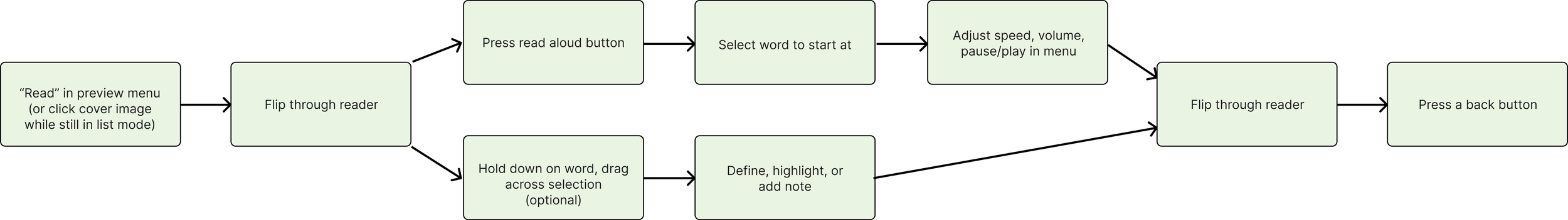
Flow 2: Read & engage with digital-exclusive features.
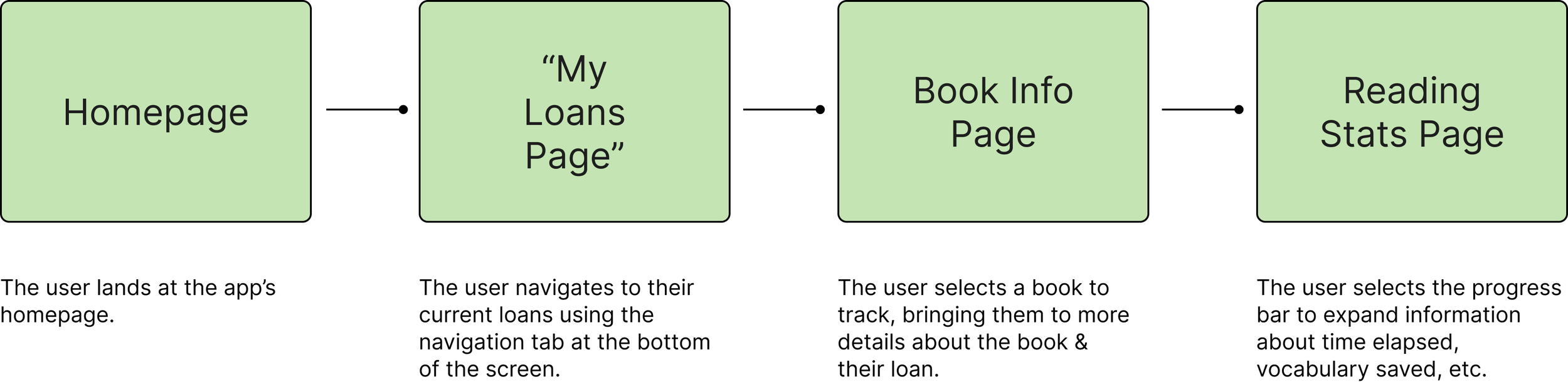
Flow 3: Track a user’s reading progress.

3. Ideate, Protoype, + Test
The Prototyping + Testing Cycle
During the user testing phase, my process consisted of:
Cardsorting
Paper testing
Low-fidelity journey testing
I created low- and medium-fidelity prototypes for users to test and provide feedback. I looked for the users’ thought process as they navigated, taking note of the UX’s strengths and shortcomings.
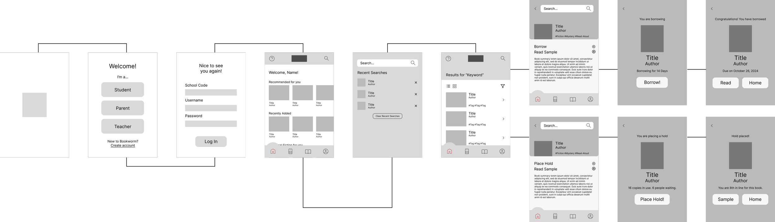
Wireframe 1: Sign in & borrow an eBook.
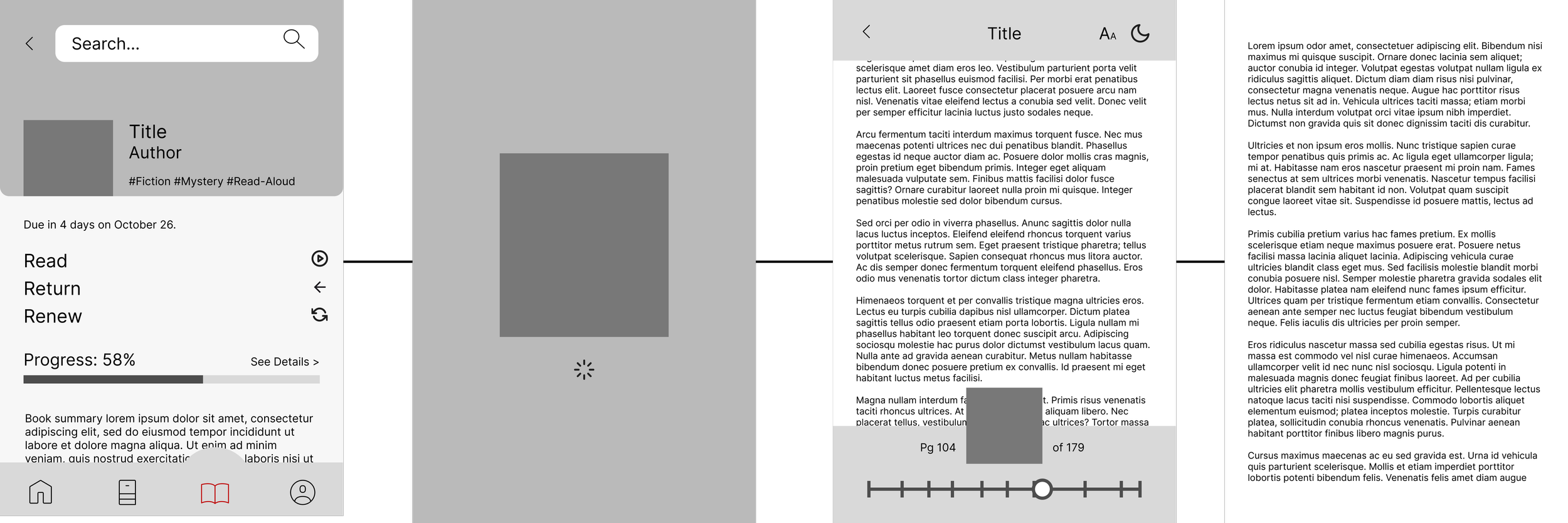
Wireframe 2: Read & engage with digital-exclusive features.
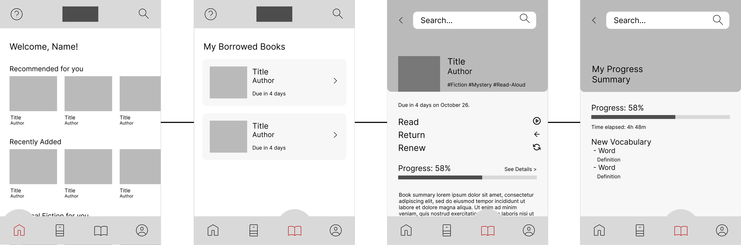
Wireframe 3: Track a user’s reading progress.
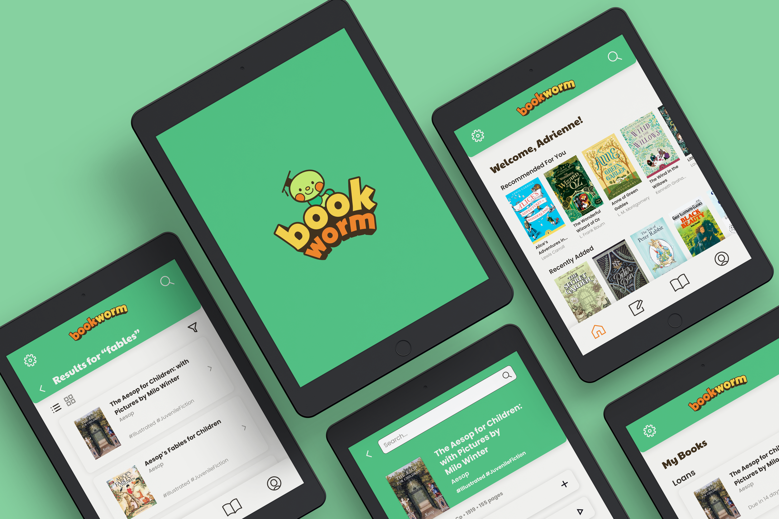
Final Prototype
-
![]()
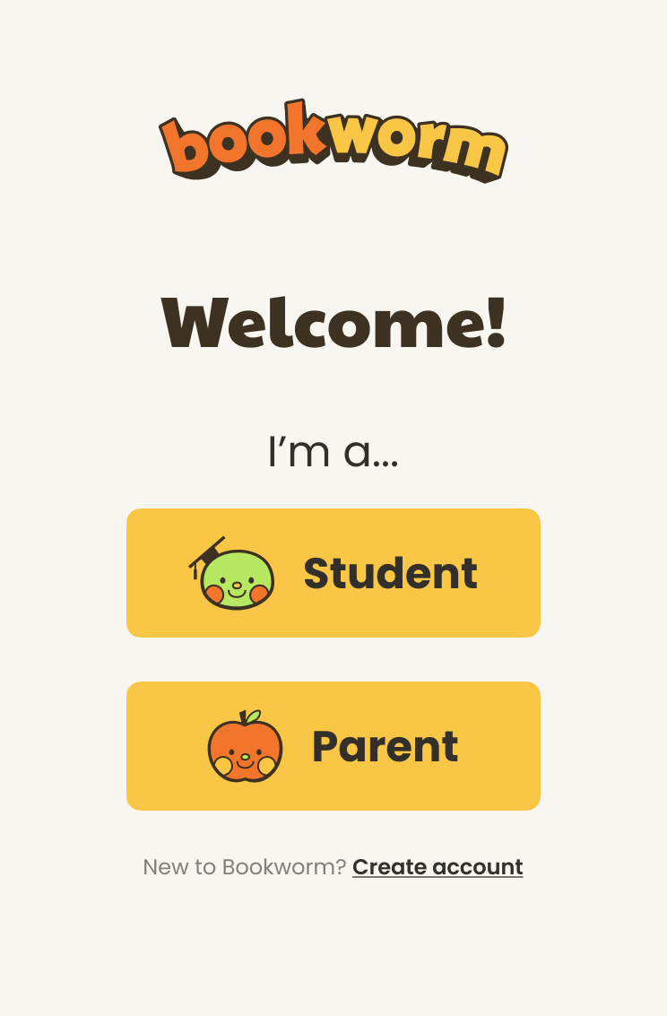
Login Portal
-
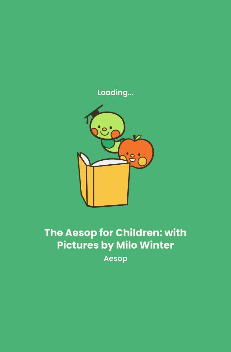
![]()
Loading Reader
-
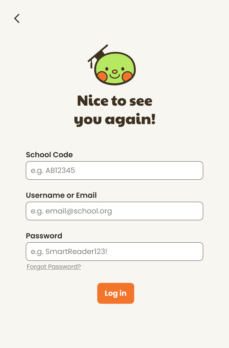
![]()
Login
-
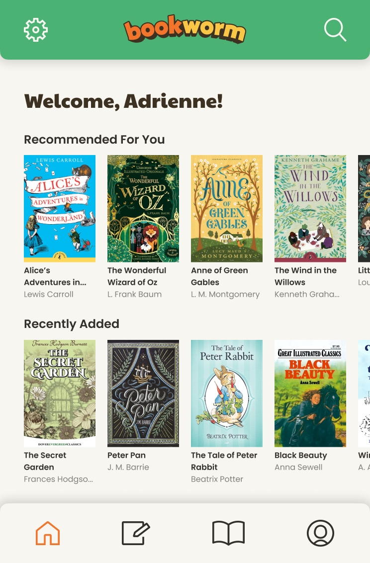
![]()
Homepage
-
![]()
Loan Confirmation
-
![]()
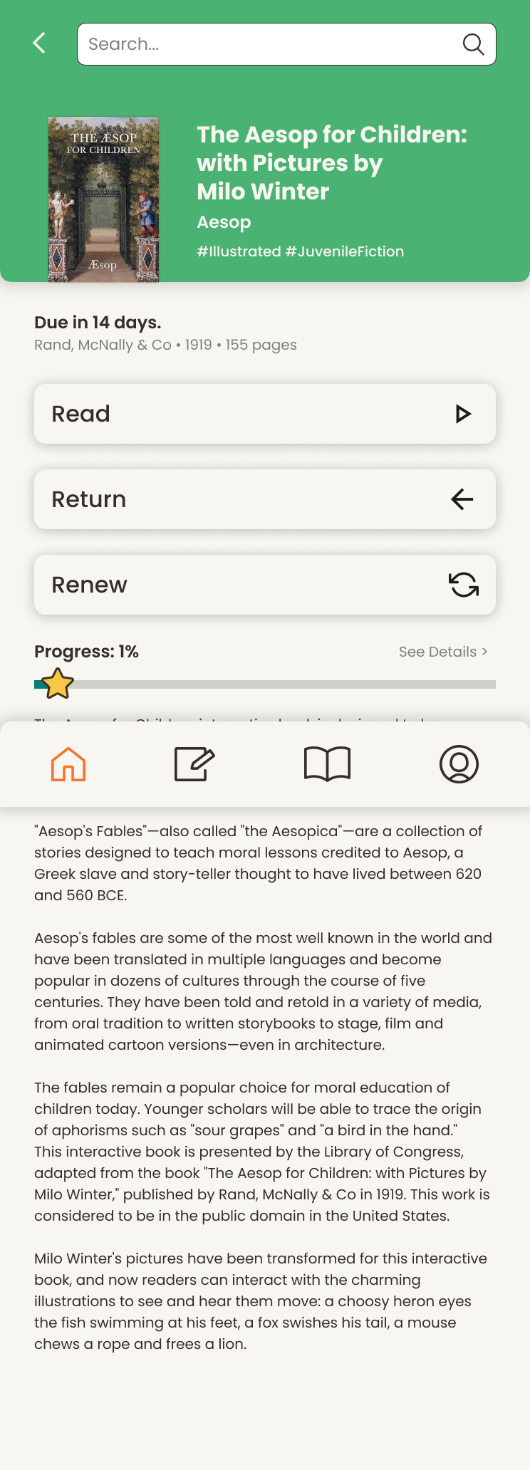
Borrowed Book Details
-
![]()
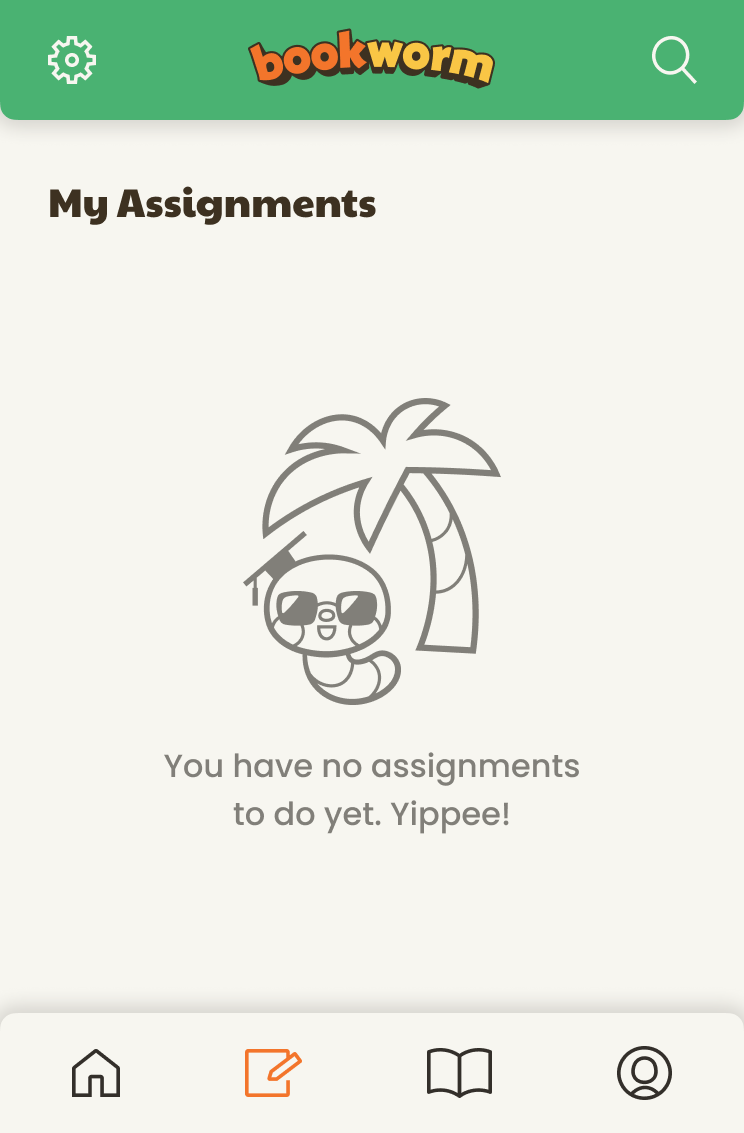
Assigned Reading
-
![]()
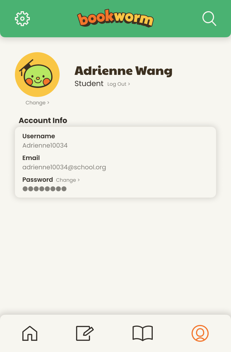
Profile
-
![]()
Reading Progress
-
![]()
Active Loans