Heart of Lansdale
A local branding campaign bringing a vibrant sense of community.
Scope: Brand Identity + Placemaking
Industry: Civic
-
Promote tourism and community building with a brand identity for Lansdale, PA’s Main Street.
-
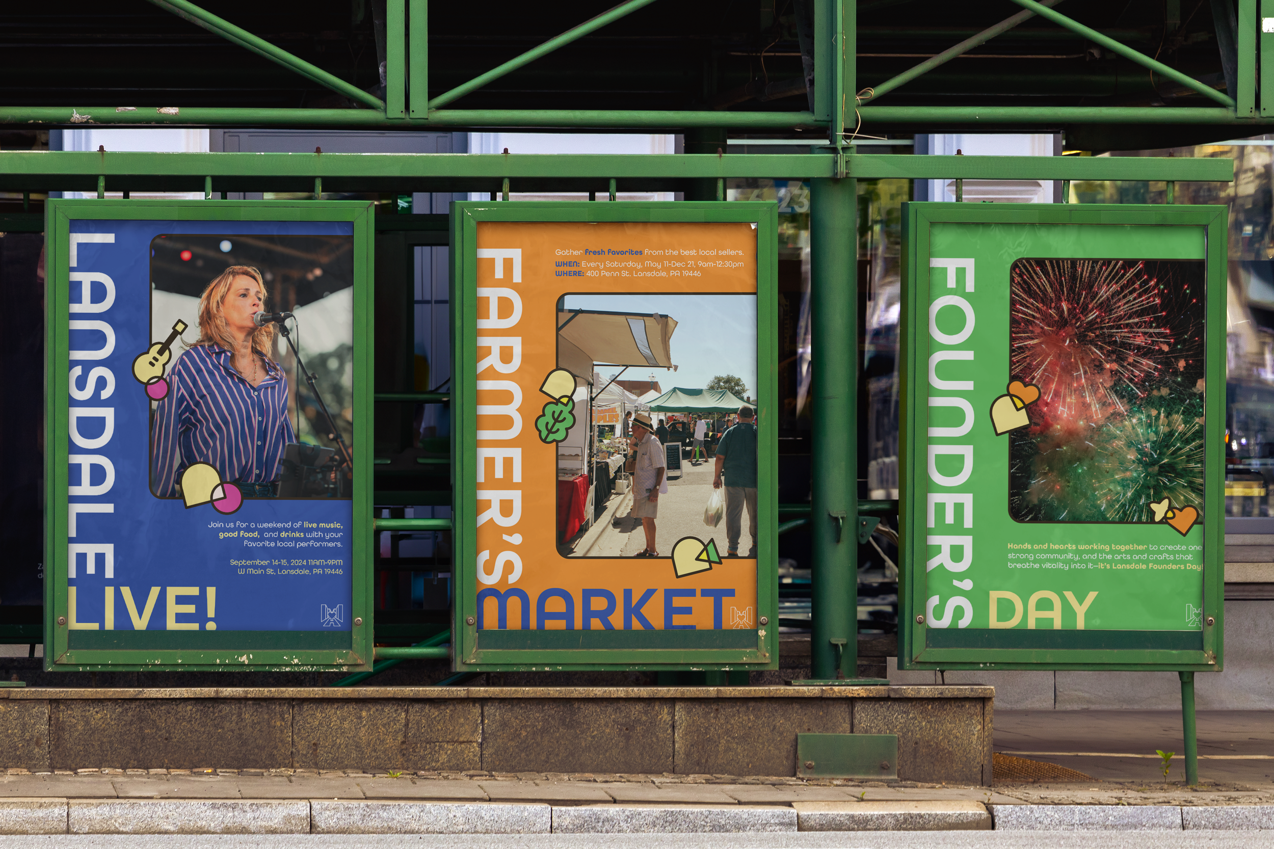
Lansdale is full of families and young adults who enjoy going out; by branding Main Street as the “Heart of Lansdale,” this campaign encourages residents to not just spend time here, but take pride in Main Street as the center of their community.
With this branding project, I hope to bring more business to the shops and venues that call this place home.
-
My strategy positions Main Street as a vibrant civic center where families and young adults gather, connect, and support local businesses.
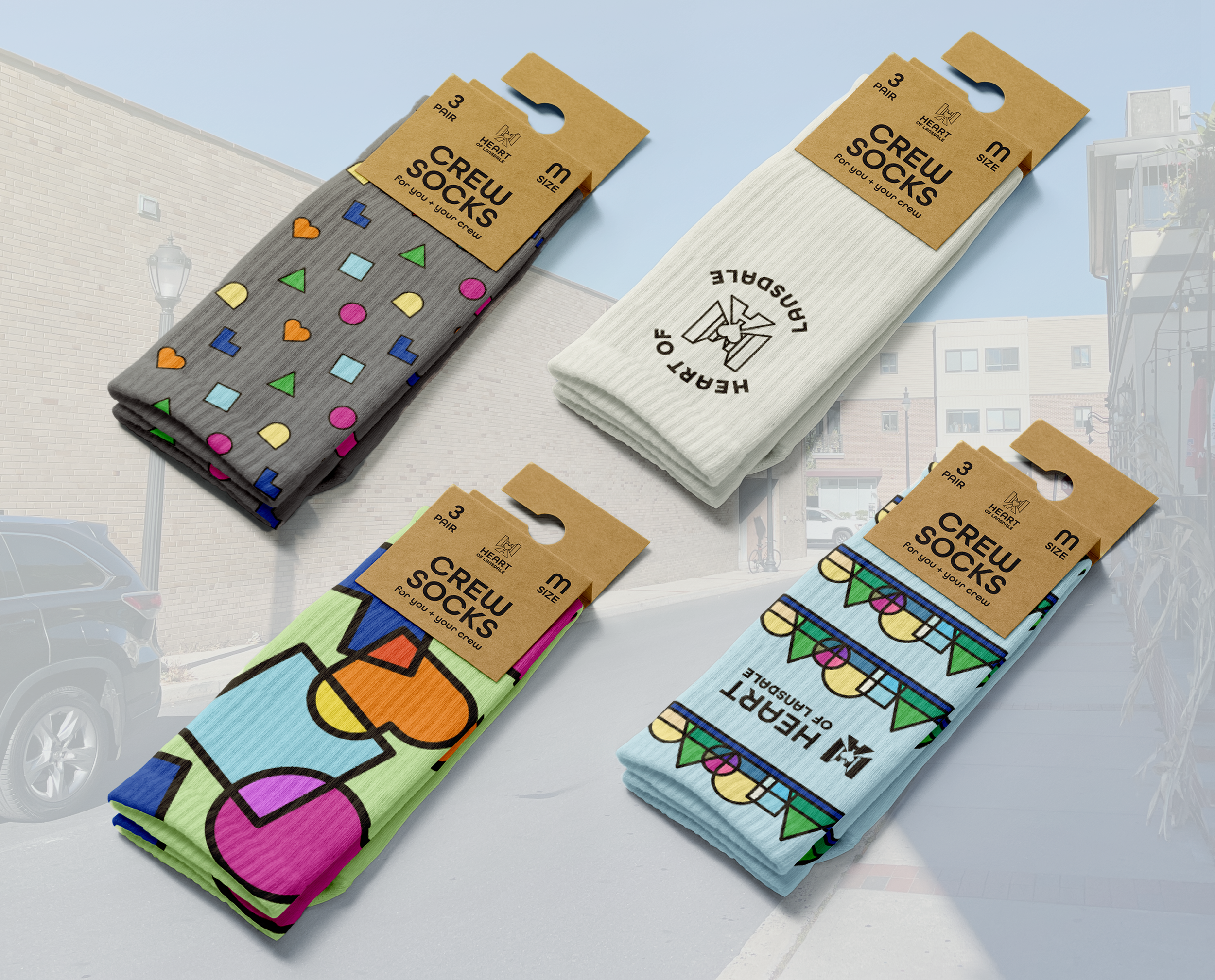
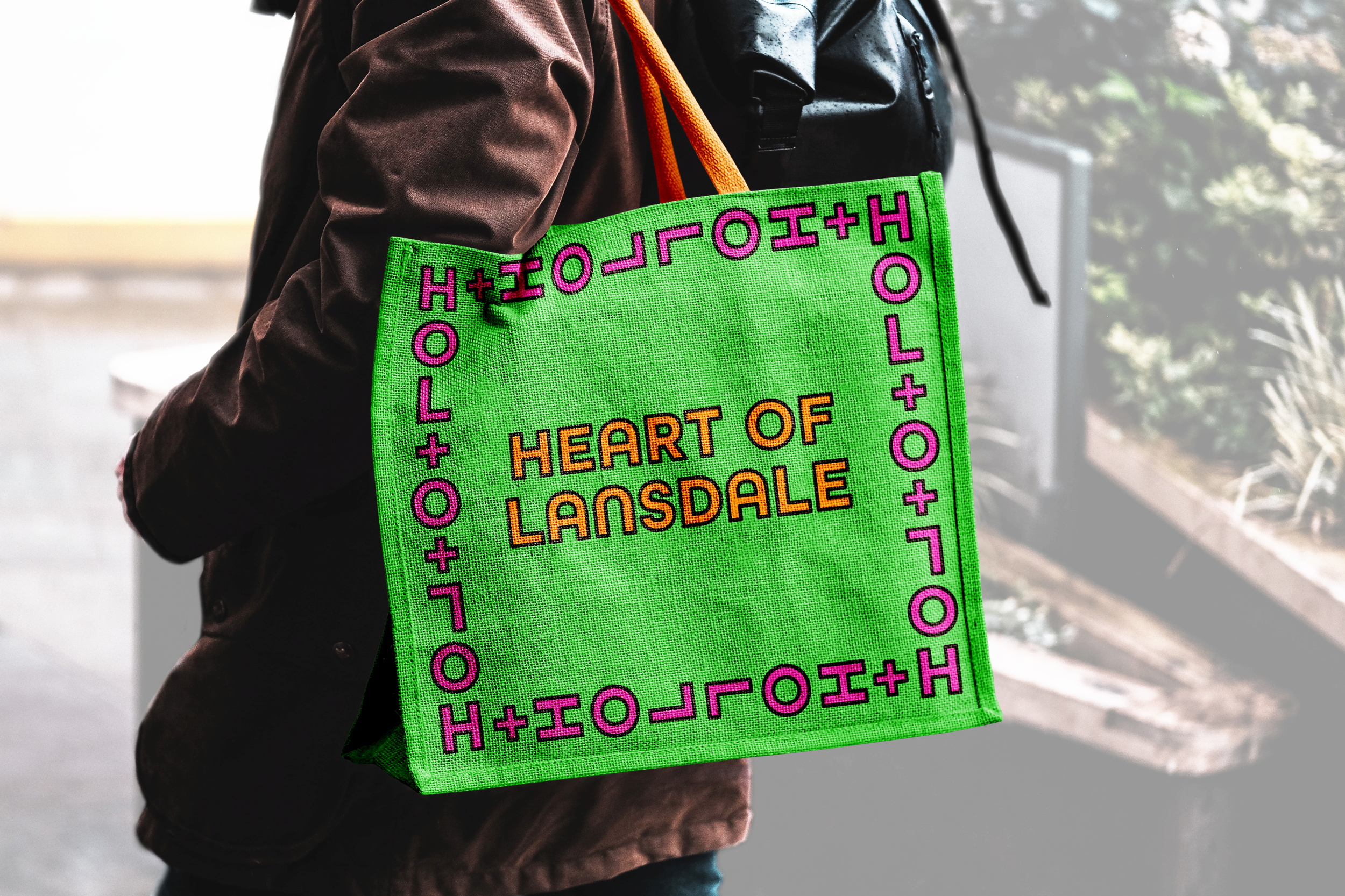
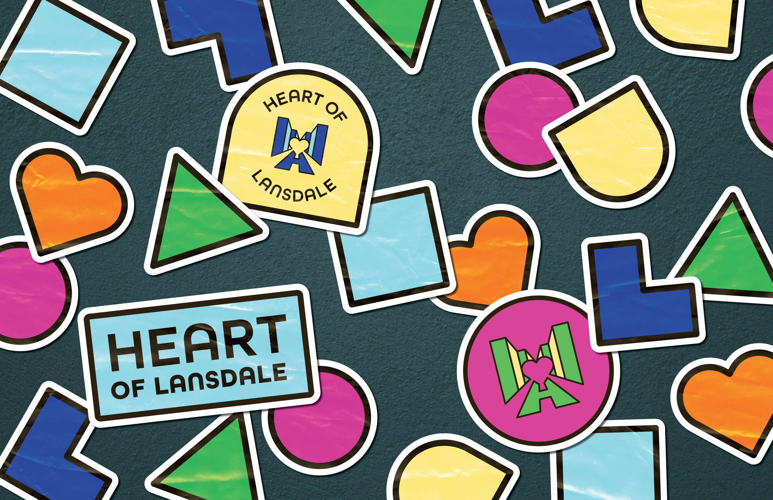
A high-chroma color palette + system of icons translates Lansdale’s core values into a dynamic visual language, reinforcing the cultural vibrance of the borough.
The logo and supporting system work together to express a shared environment centered on community experience.

Ideation


-
Each color in the identity system is paired with its own shape. Each shape represents a core value that visitors experience in Lansdale: diversity, agriculture, music, activity, shopping & dining, and the spirit of the town.
-
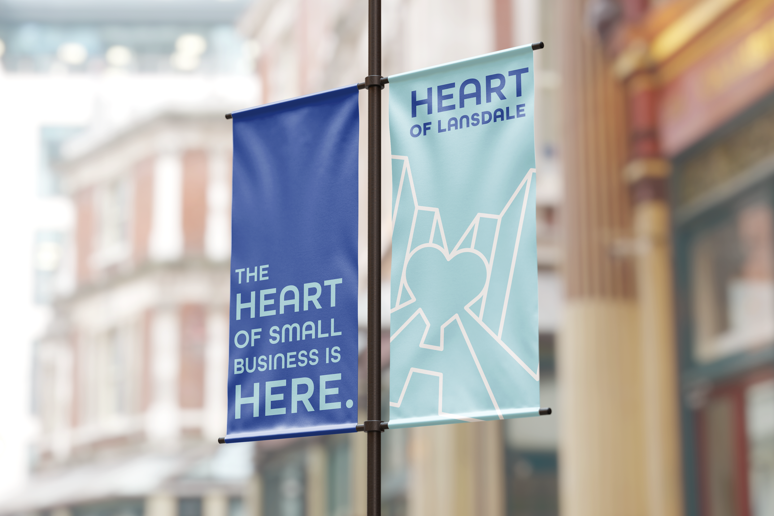
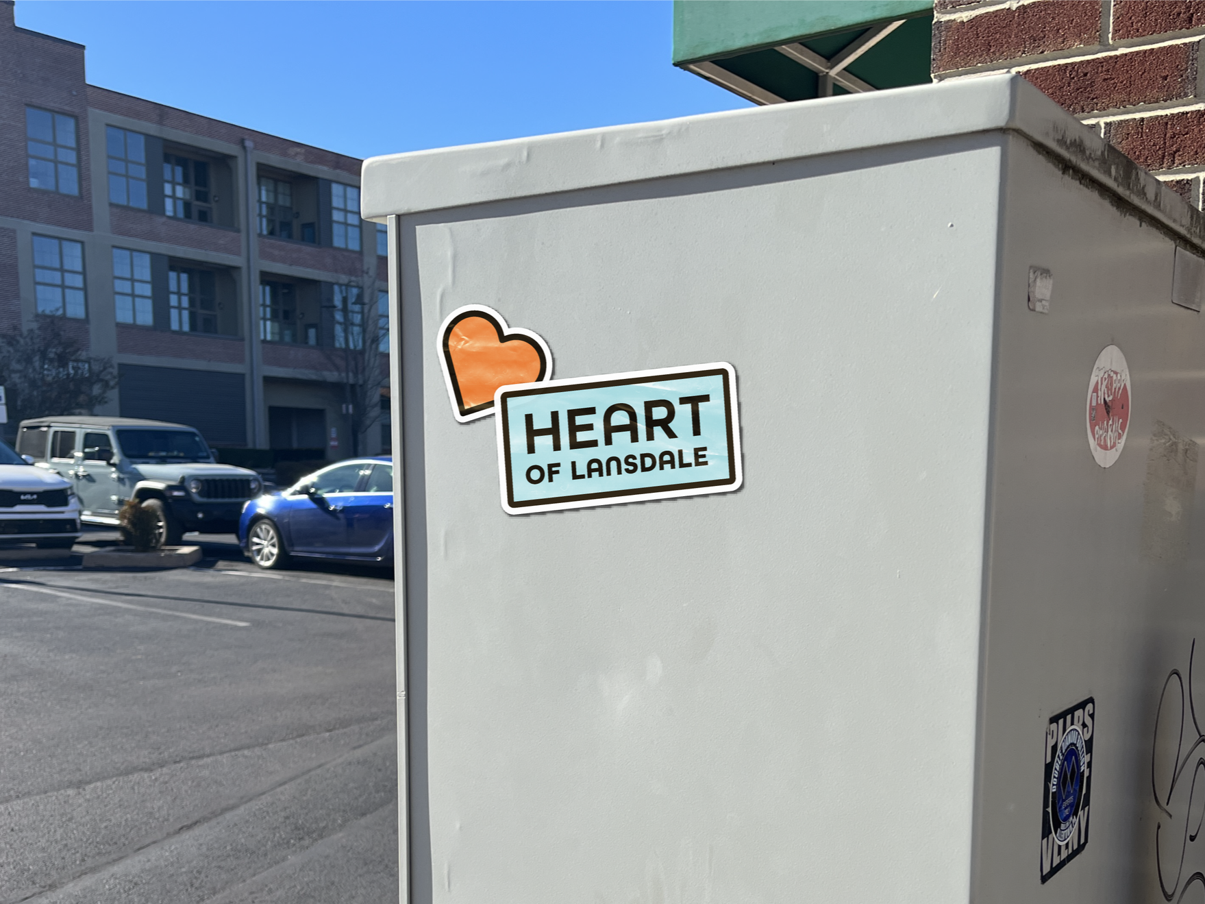
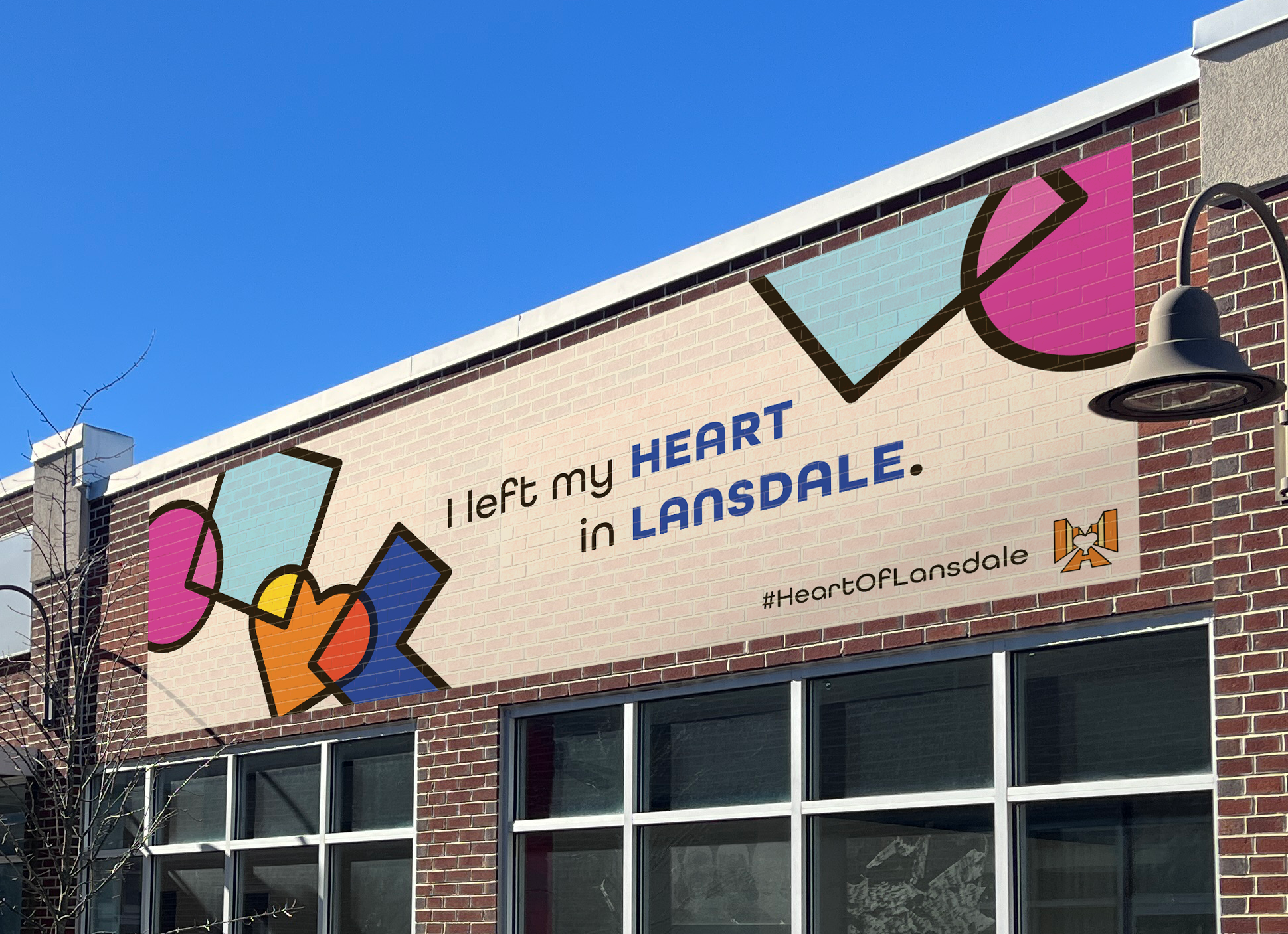
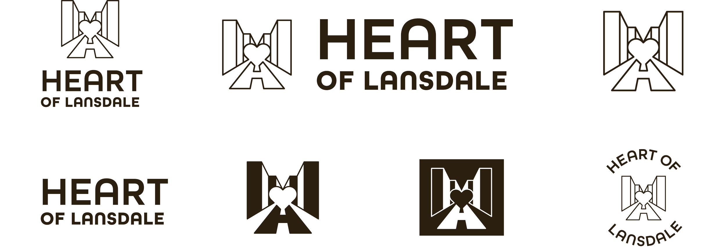
The logo depicts Main Street as seen from the middle of the road. At its center is a heart in negative space, as if to say that all it's missing is "you". The shape that makes the street also doubles as a letter H, for heart.
The primary brand colors, dark and light blue, integrate the campaign with Lansdale Borough's existing brand identity, complementing the borough as a whole.

Brand in Context