The Trevor Project
Rebranding the leading LGBTQ+ suicide prevention organization with a warm, Gen Z-focused identity.
Scope: Brand Identity + UX Design + Illustration
Industry: Non-profit
-
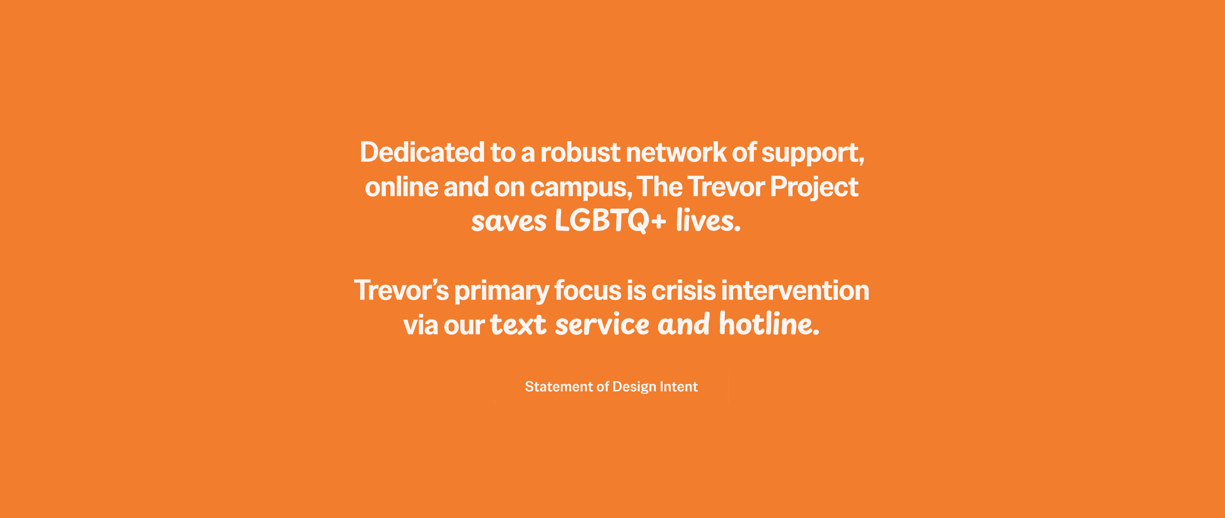
Develop a refreshed brand identity for The Trevor Project, a non-profit suicide prevention organization that provides 24/7 crisis support services, research, and advocacy for LGBTQ+ young people.
-
The Trevor Project serves LGBTQ+ people under 25. The organization also provides resources such as training programs for educators, coaches, and parents to support LGBTQ+ youth.
The Trevor Project’s brand book breaks down their audience into 5 groups: LGBTQ+ Young People, Donors, Volunteers, Adult & Peer Supporters, and the General Public.
-
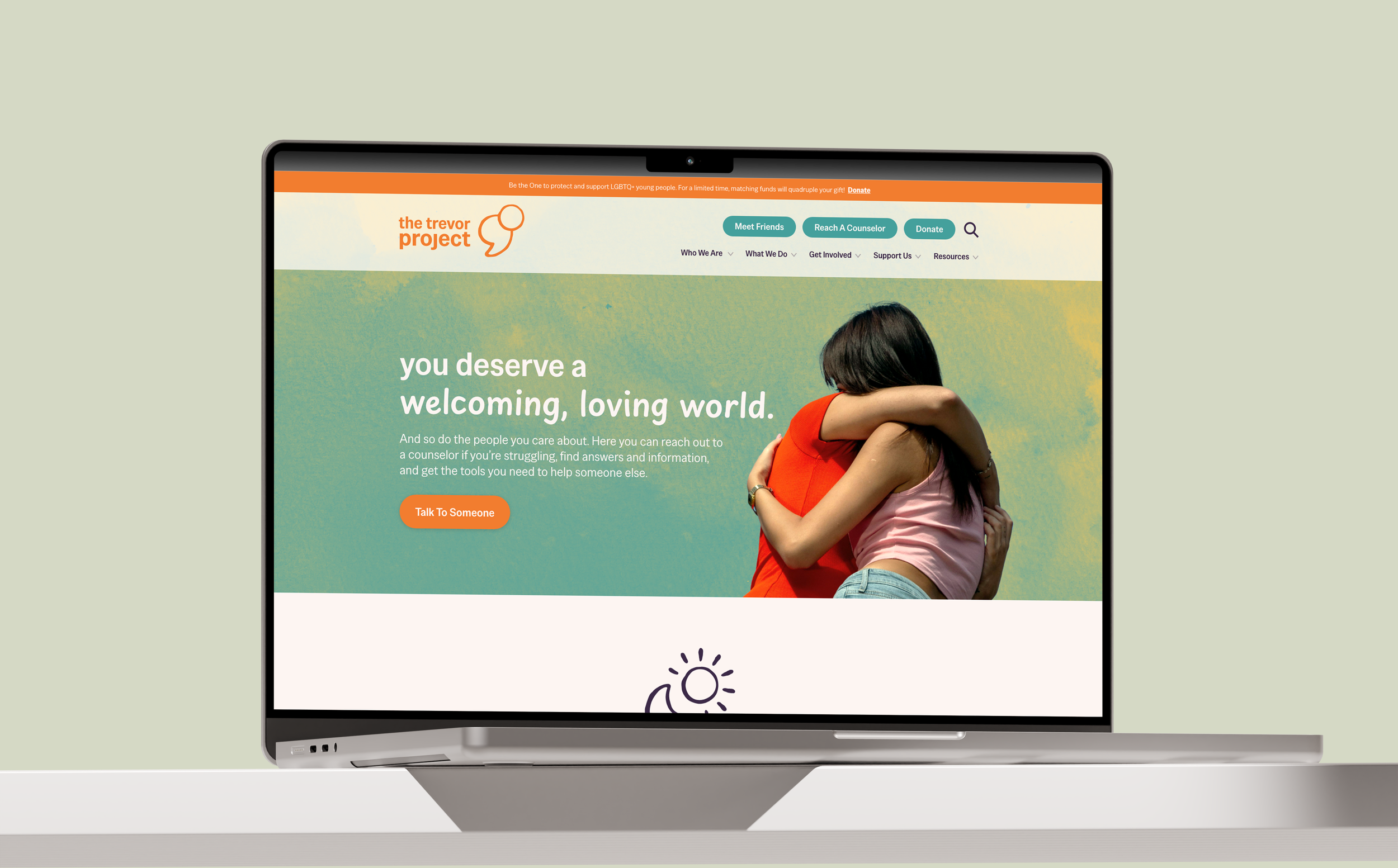
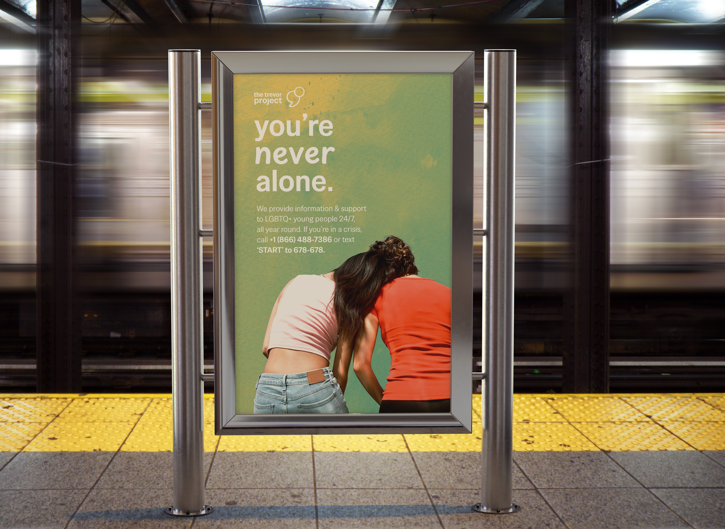
To deepen The Trevor Project’s connection with their audience, my creative decisions were informed how LGBTQ+ young people in crisis actually experience support. This audience turns to the internet first, especially if reaching out to adults in their life feels unsafe. For this refresh, the audience needs to see themselves reflected honestly.
Swapping harsh neons for warm pastels, the refresh incorporates fluid textures, more realistic illustrations, and a distinctly ‘online’ typographic style. All of these elements position The Trevor Project as peers committed to support and safety, not another cold and sterile authority.
Research + Ideation
-
The first step of the ideation process began with an assessment of The Trevor Project’s current brand positioning. I researched the brand in terms of:
Brand History
The Audience
Differentiators
Competitive Analysis
Intended Brand Voice
This allowed me to stay true to The Trevor Project’s history and values while enhancing the features that may have gotten lost. I also conducted a SWOT analysis targeting the brand’s visual design specifically.
Strengths
Breadth of resources available on website
Illustrations are balanced out by photographs of real people
Weaknesses
Imbalanced lockup makes it difficult to appear aligned
Current art style with blue and orange skin tones feels corporate + impersonal
Opportunities
Logomark could link to the organization’s story/purpose
Web hierarchy could be clearer to find crisis support faster
Threats
Potential loss of donations or government/988 funding
Imbalance between warm messaging + serious subject
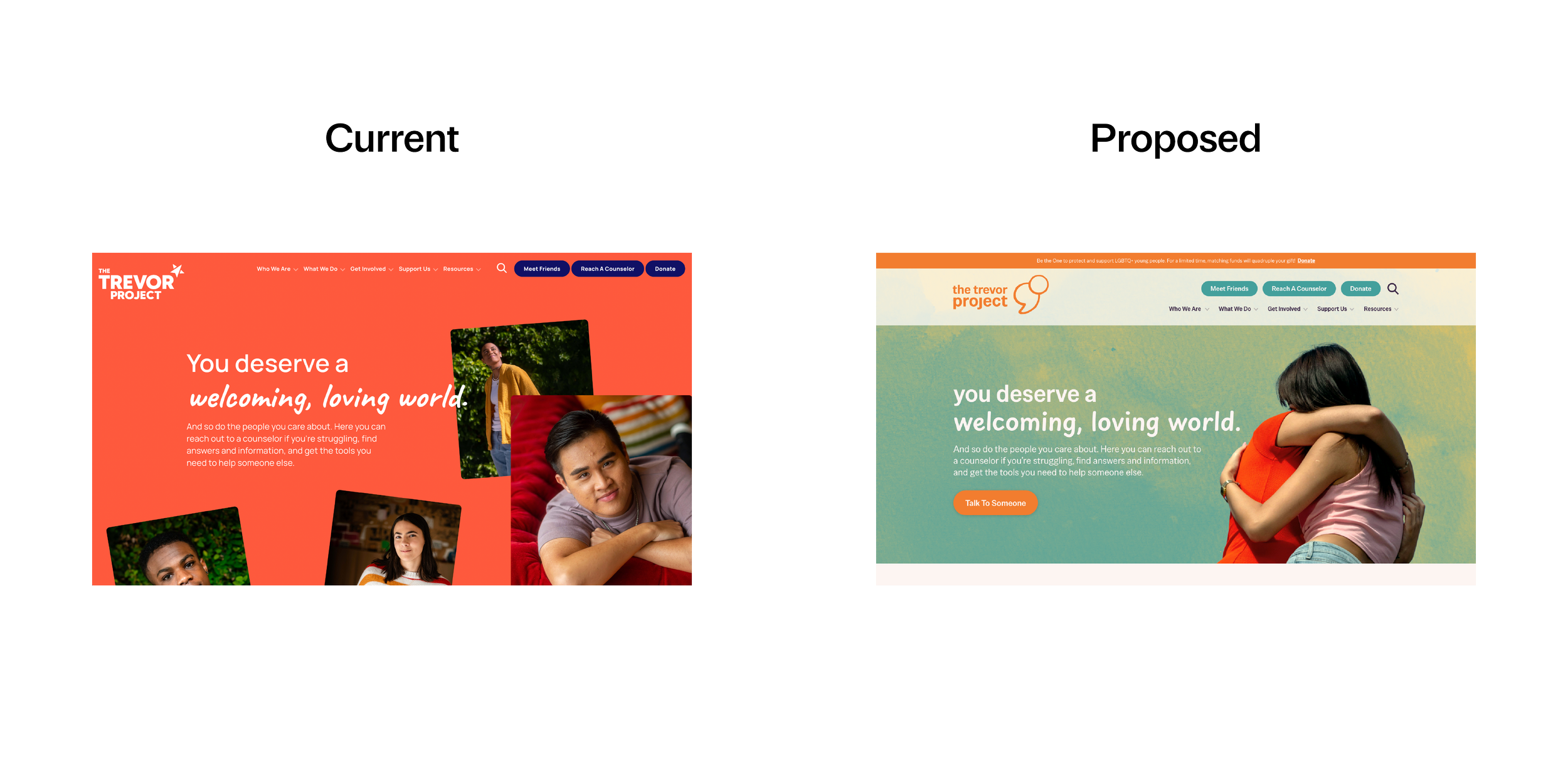
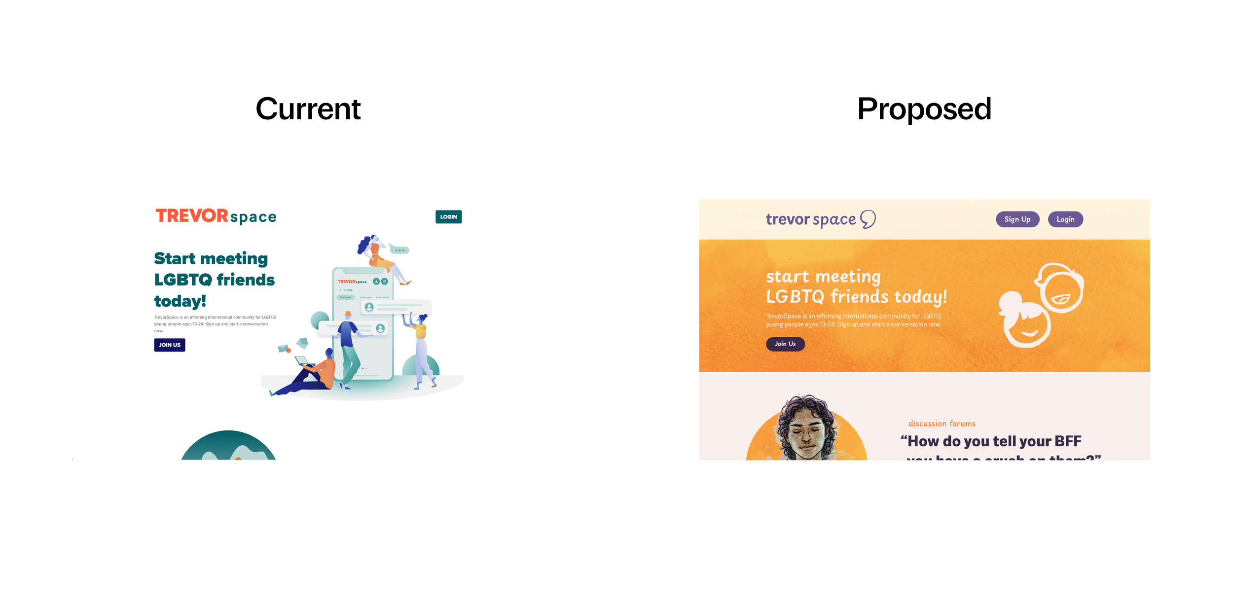
Current
Proposed
Behind the Logo
-
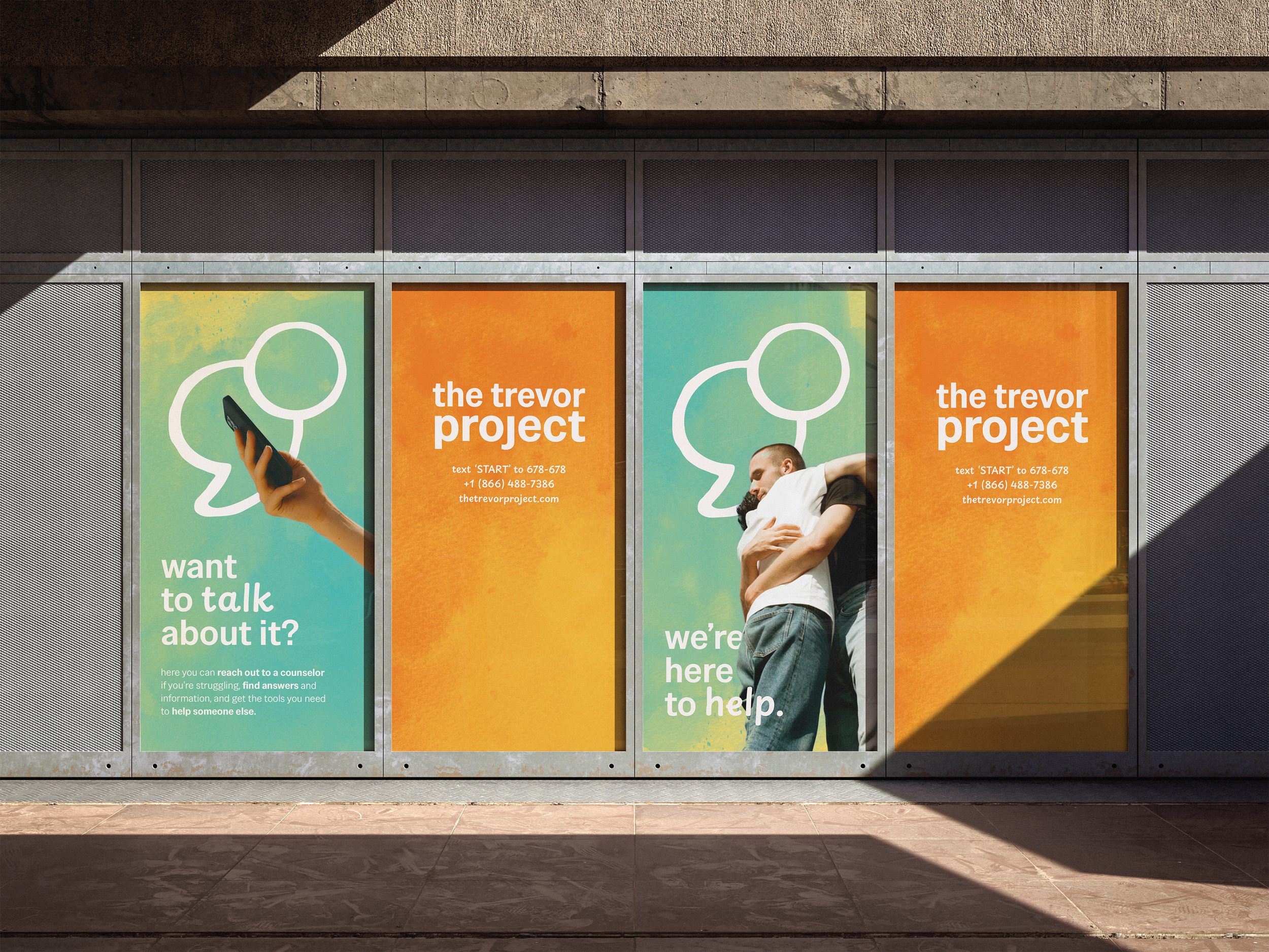
The Trevor Project’s primary features are their hotline, text/SMS, and chat services. This became a focal point; the logo and type treatment should feel like a text message.
I chose Special Gothic to strike the right balance between text-like clarity and energetic warmth. The type is set in all lowercase, a common way that young people type on the internet. It also brings a calmer tone, helping to disarm someone in distress.
-
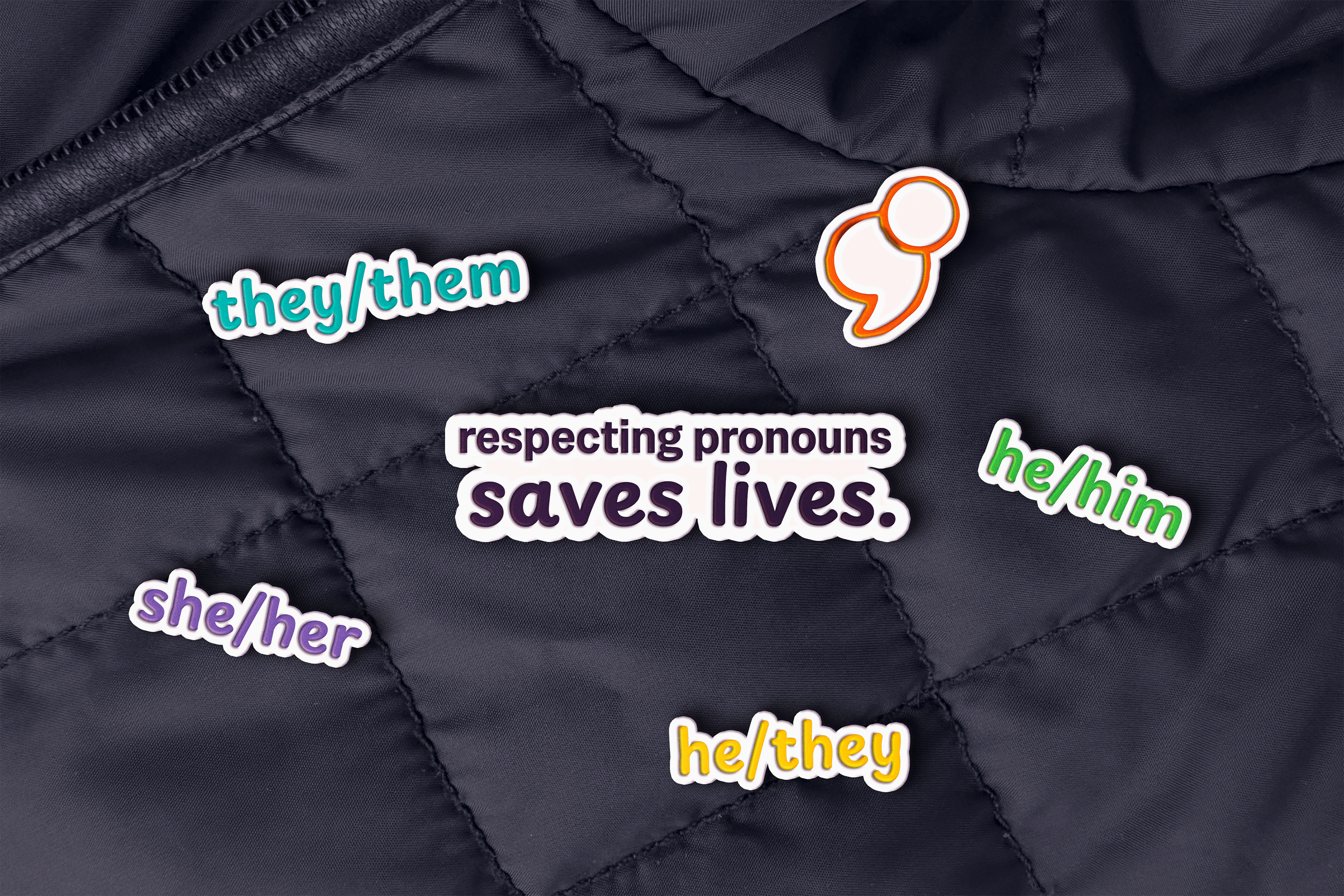
The Trevor Project’s current star logo has few meaningful ties to the brand’s origins or mission. I swapped the star for a new logomark that combines two meaningful icons: a semicolon and a speech bubble.
Young people using The Trevor Project may recognize the semicolon as a symbol of surviving suicide. Popularized by Amy Bleuel in 2013, the semicolon “represents a sentence that the author could have ended, but chose not to. The sentence is your life and the author is you.”
The speech bubble signals that someone is here, ready to respond, through the channels young people already use.
-
After deliberation, I made the decision to place the semicolon to the right of the wordmark.
Though unconventional, this move grounds the icon as a semicolon, following punctuation rules to push the icon’s meaning.
This lockup also provides a unique visual weight to the top right corner, guiding the eye forward and up. Like the original logo, but more balanced, this lockup suggests a sense of optimism.
-
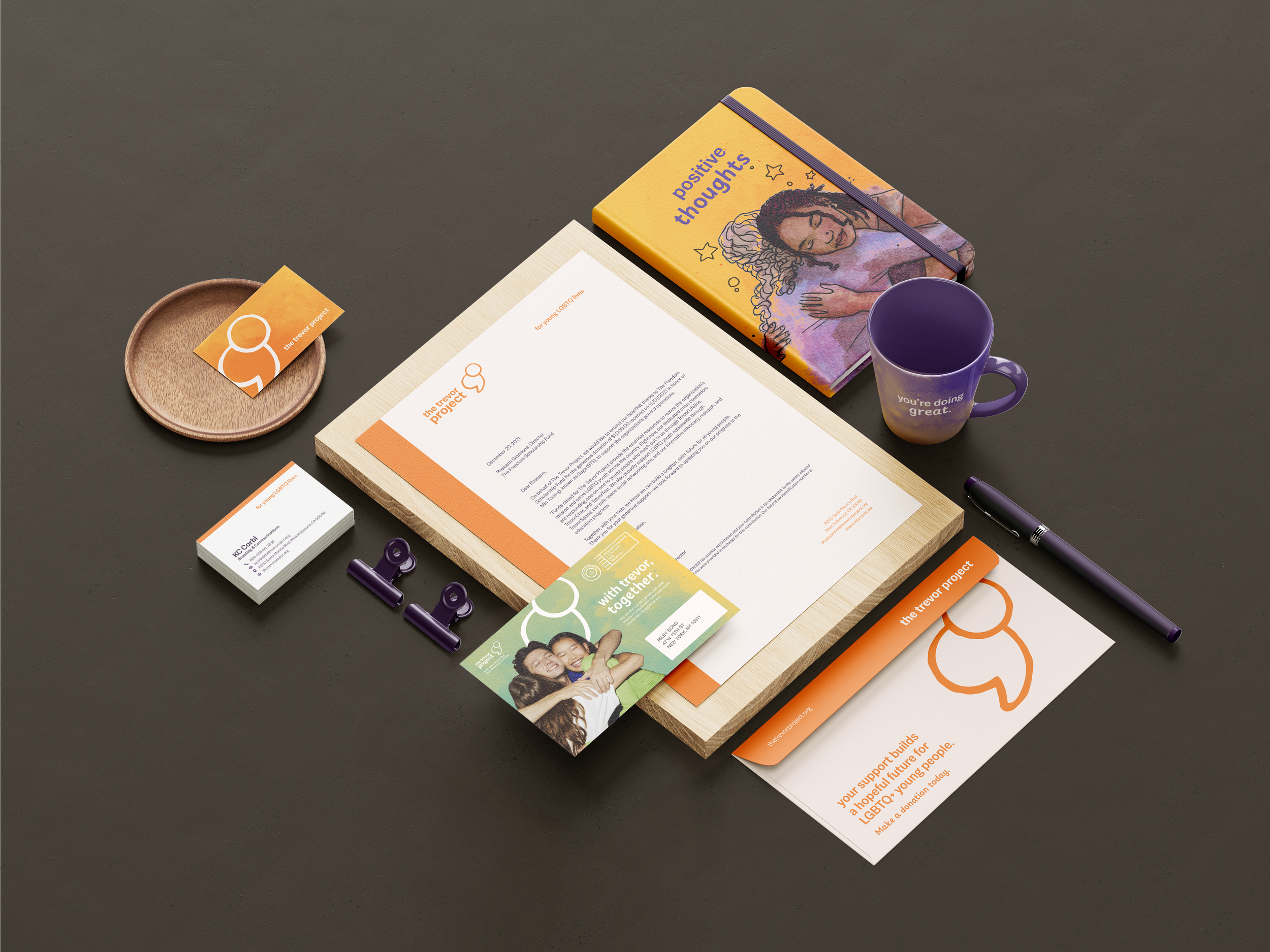
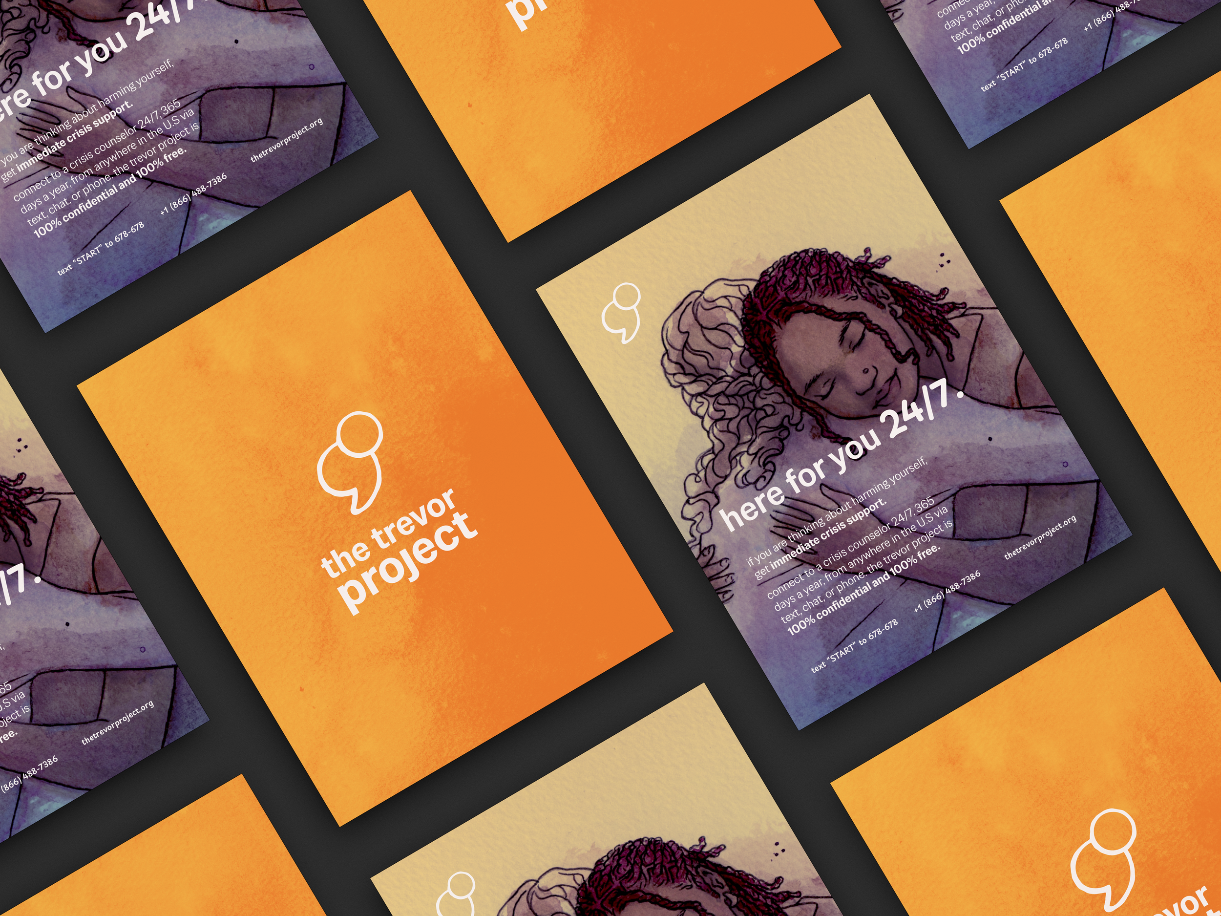
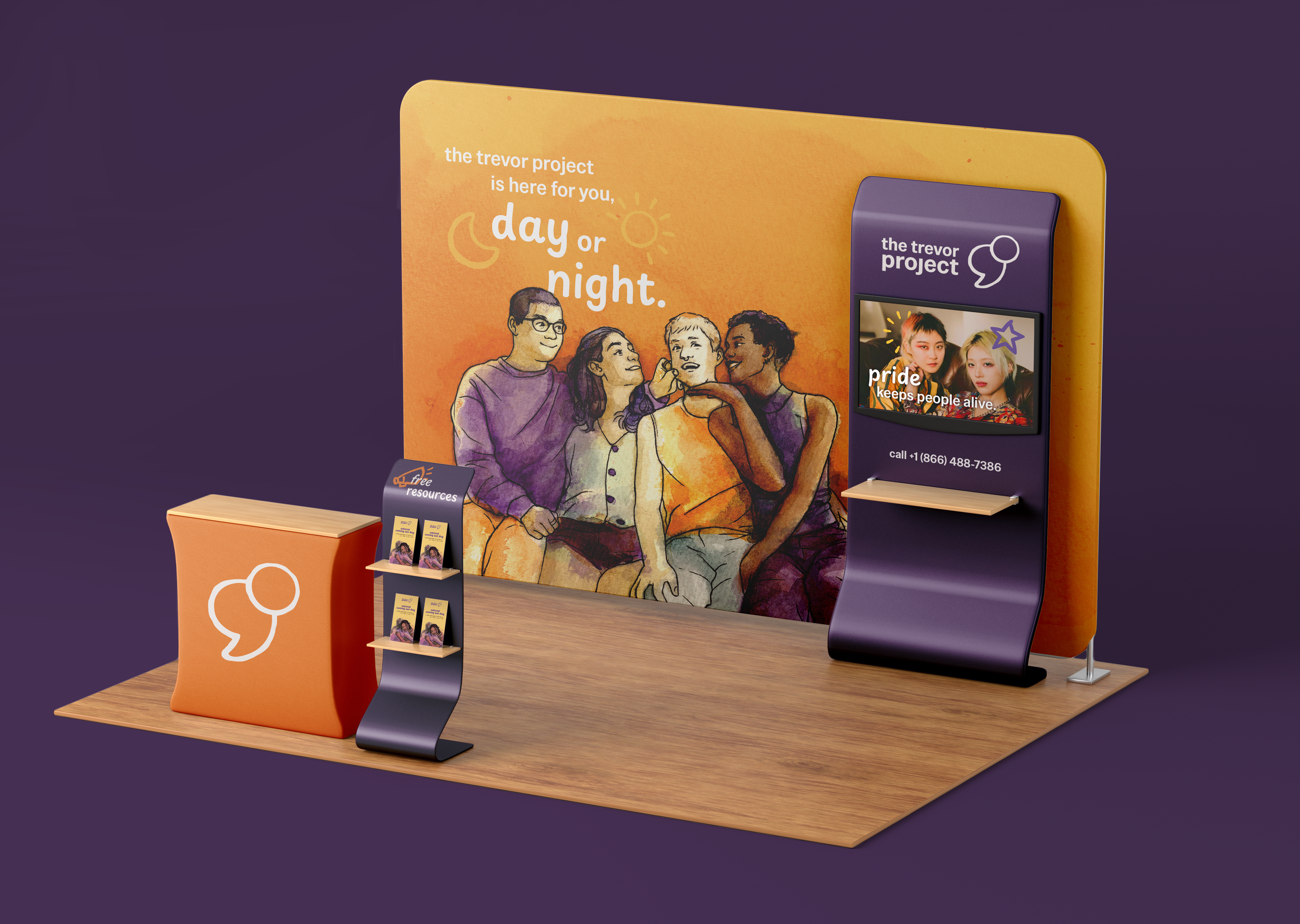
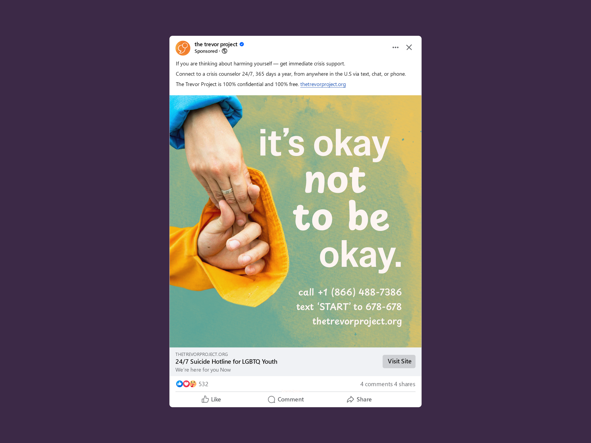
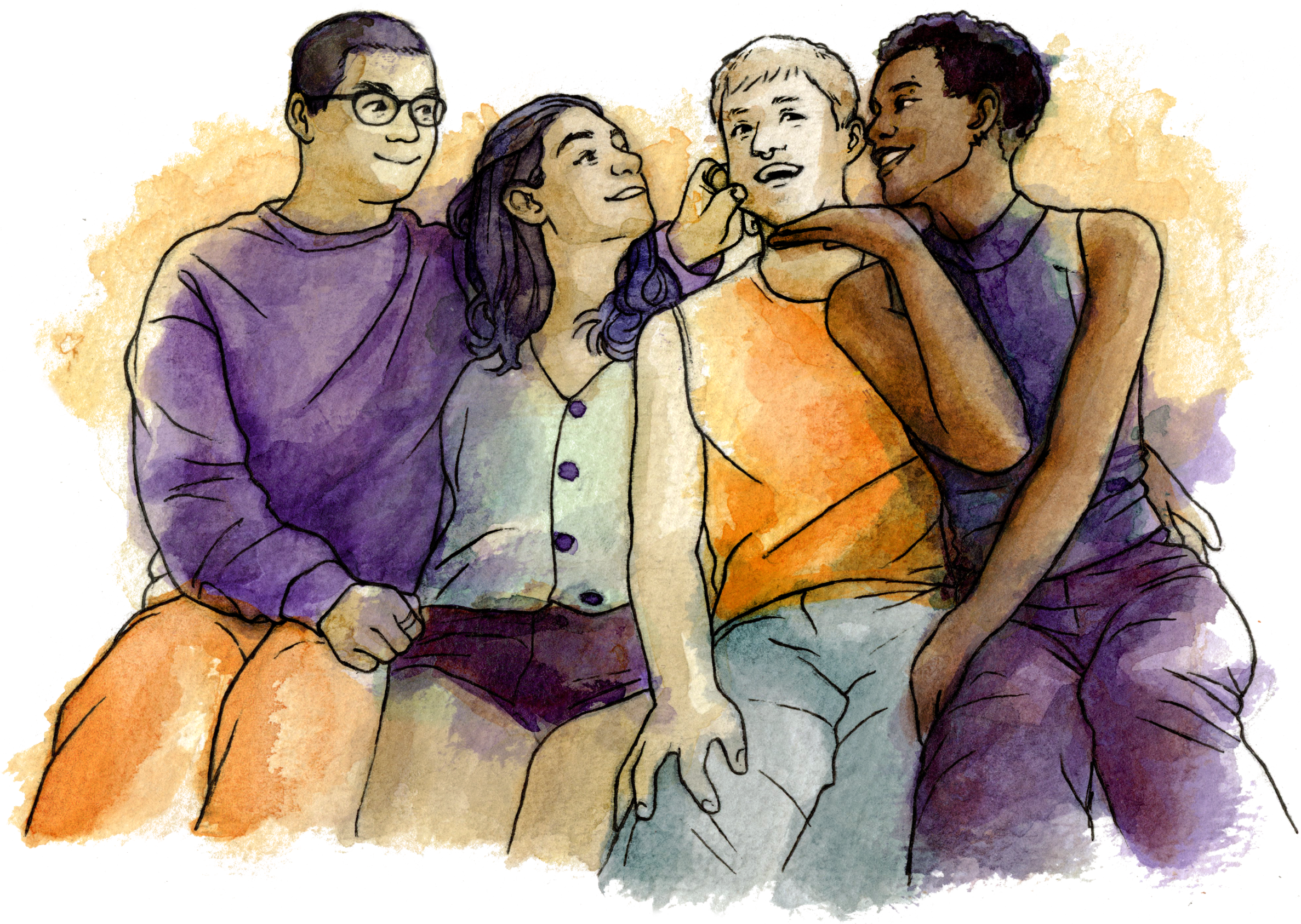
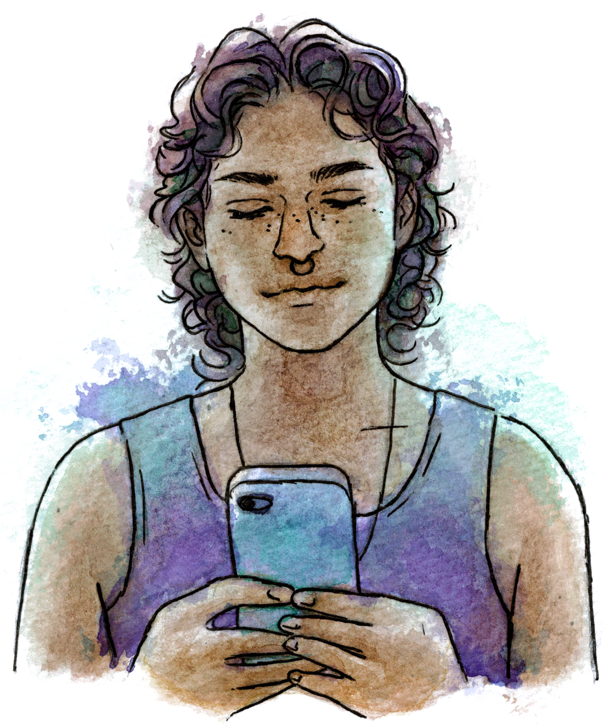
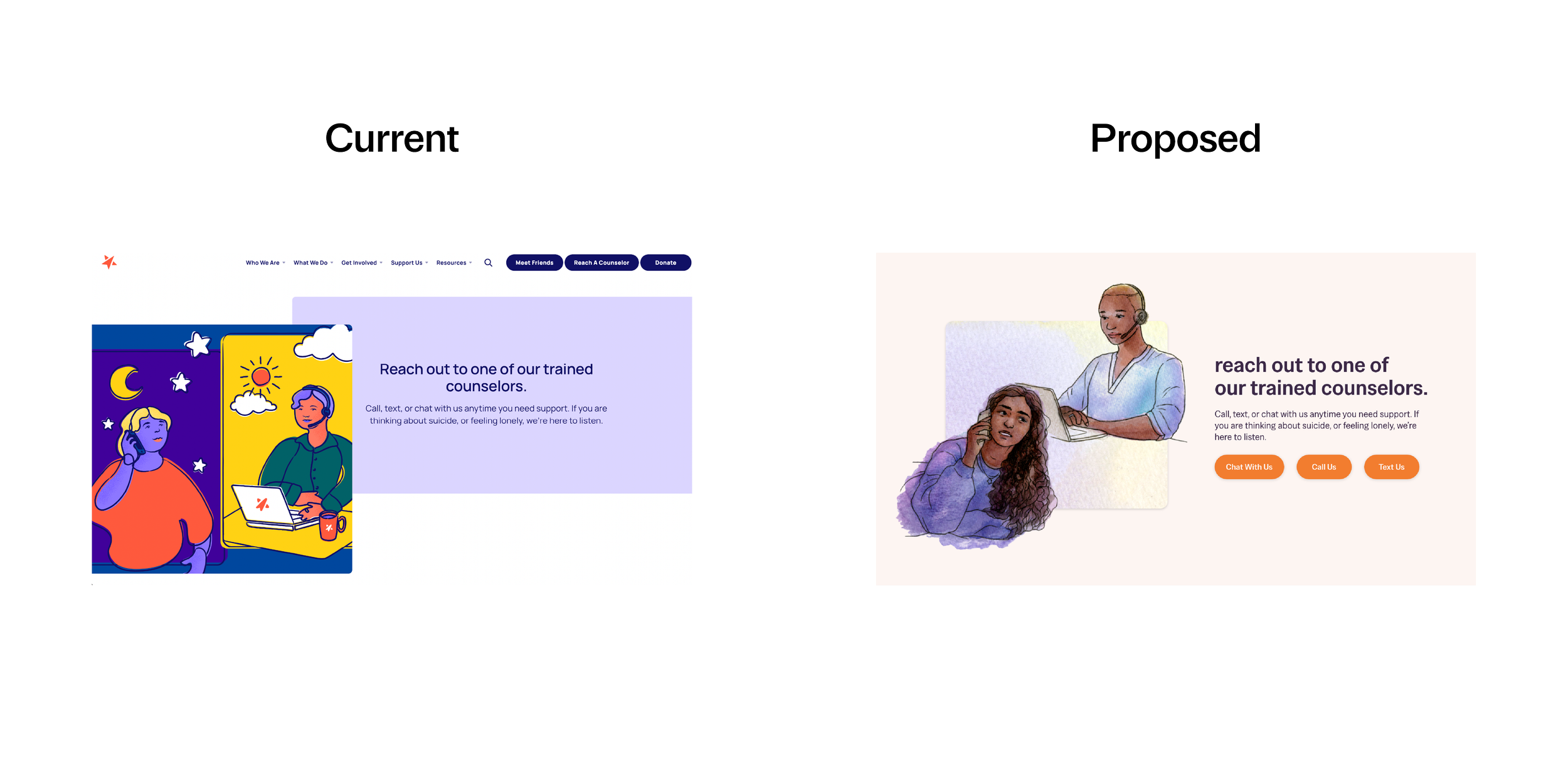
The revamped art style abandons Corporate Memphis for something more human. I hand-illustrated a collection of ink wash portraits with natural skin tones, representing real people who use The Trevor Project.
I aimed to portray a diverse audience without using amorphous, blue-skinned people; this way, more people could see themselves in the art.
-
Using ink wash was an intentional choice for brand messaging. This water-based medium creates organic, soothing gradients, useful for creating a calm environment.
Here, colors intentionally flow outside the lines. This decision was guided by the idea that gender and sexual identity are fluid; you don’t have to fit in a box to be loved, and you don’t need to be put together to be supported.


Brand in Context
-
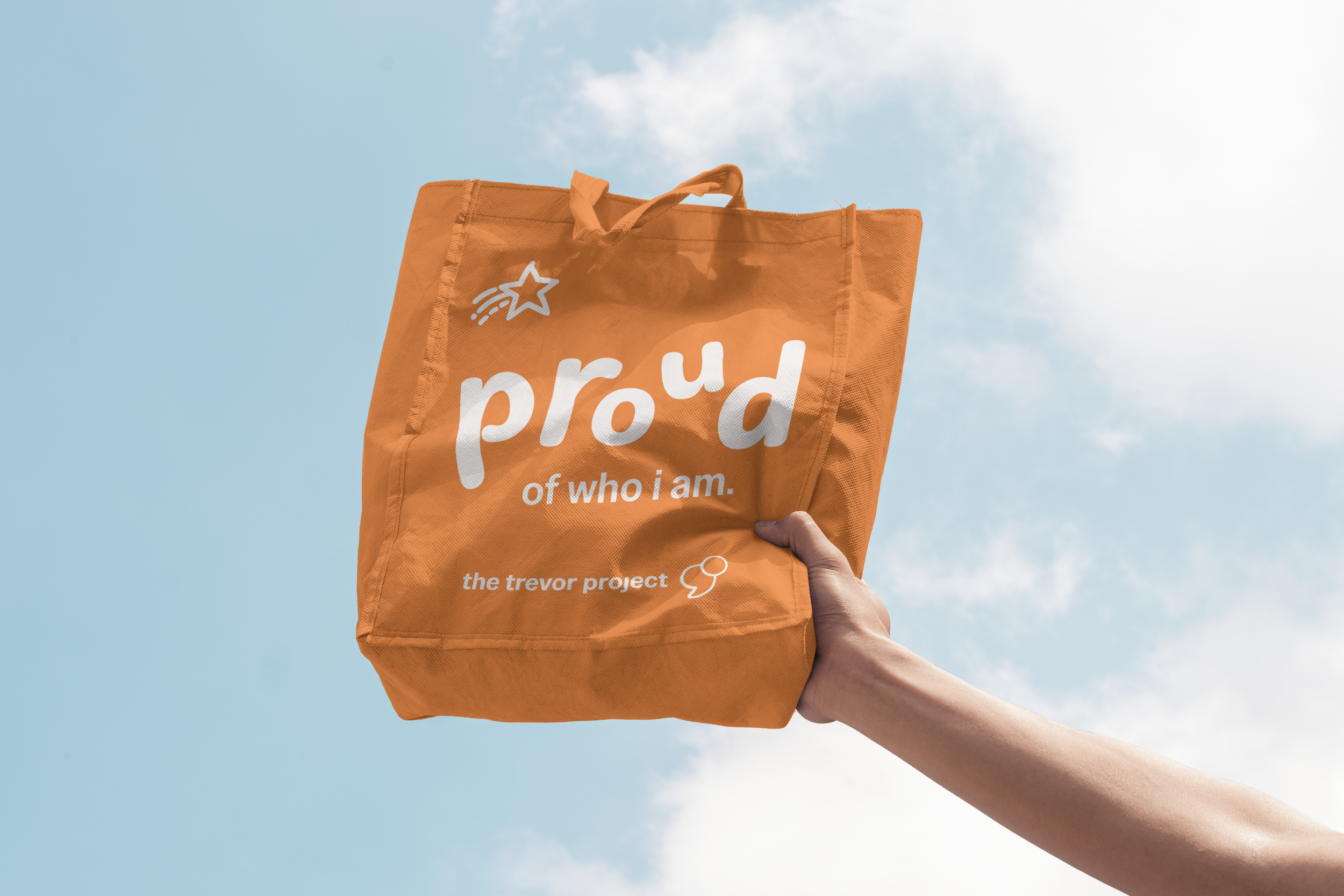
While orange and purple worked great as The Trevor Project’s signature palette, it needed an update. Shifting towards a yellow-orange communicates more optimism and less harshness.
I wanted to bring the rainbow into the palette without being too obvious or cliché. Integrating gradients of blue, yellow, and green, I was careful not to just slap a rainbow motif on top of the brand.

-
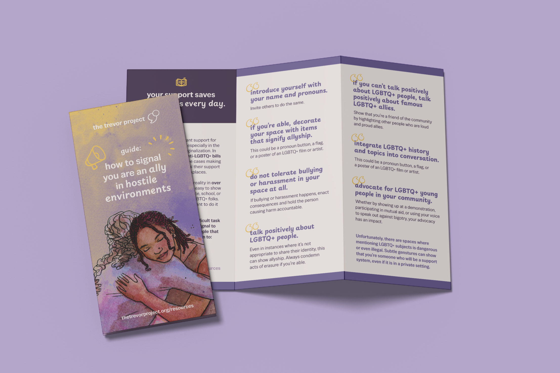
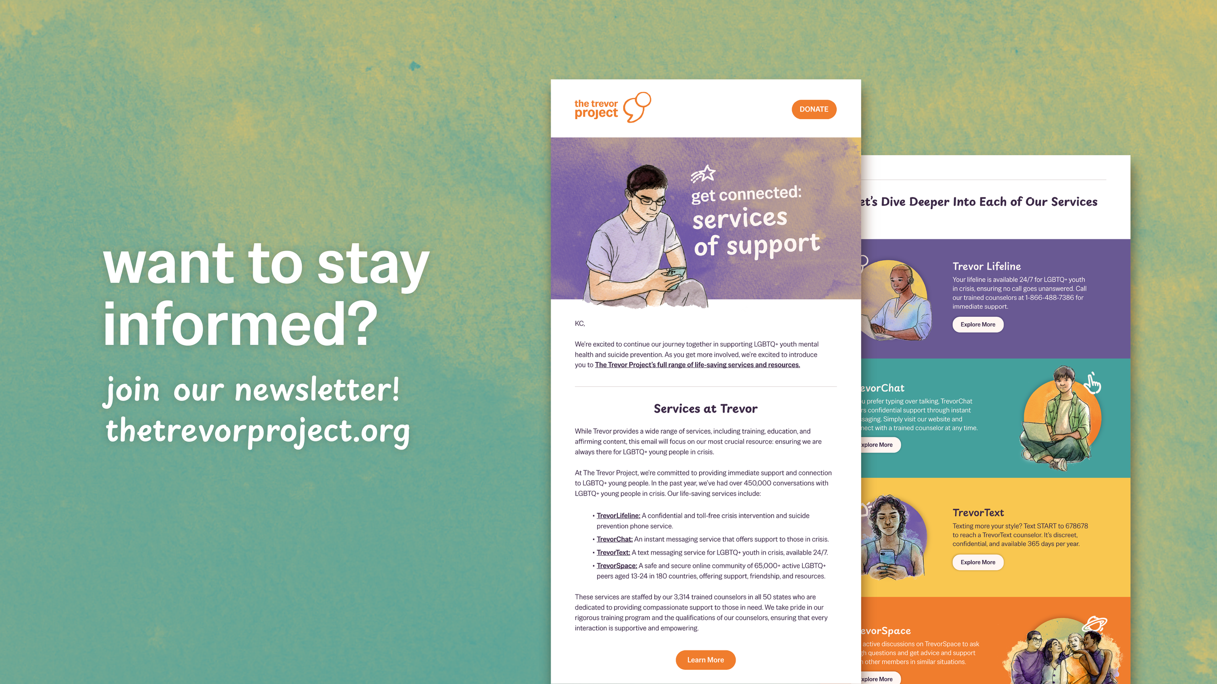
With print materials like mail campaigns and brochures, maintaining discretion was critical.
For privacy and safety, I carefully avoided any language or graphics that could inadvertently disclose sensitive information about recipients.